What is User Experience?
Table of Contents: Definition – Goal – Examples – Factors – Questions from the field – Download – Notes
Smartpedia: User Experience – also known as UX for short – describes the perceptions and reactions of a person resulting from the use of a product, system or service.
User Experience definition
User Experience – often simply abbreviated as UX – is a term that focuses on the experience of a user when using a product, system or service. DIN EN ISO 9241, an international standard that lays down guidelines for human-computer interaction, defines user experience as follows:
“A person’s perceptions and responses that result from the use and/or anticipated use of a product, system or service.”
This UX definition gives rise to various findings:
- A user is a person. And who is this person? In the context of a human-computer interaction, it is a “user”. Thinking a little bit broader, a person can also be – depending on the scenario and/or industry – a customer, a guest, a patient, a client, a visitor etc. And it also means that the products, systems or services are not just computer programs, apps or websites, but all goods, products or services that people interact with.
- UX looks at the perceptions and reactions of a person. These perceptions and reactions are individual.
- User Experience does not only start with the concrete use of a product, system or service, but already in the initiation or in the run-up to a possible use. This insight is important when companies try to improve UX holistically.
The goal of the User Experience
User Experience is therefore about a person and their ideally positive perceptions and reactions when using a product. “We must put the user at the center of our considerations” is therefore an often expressed demand in the course of user-centered development, human centered design or UX design.
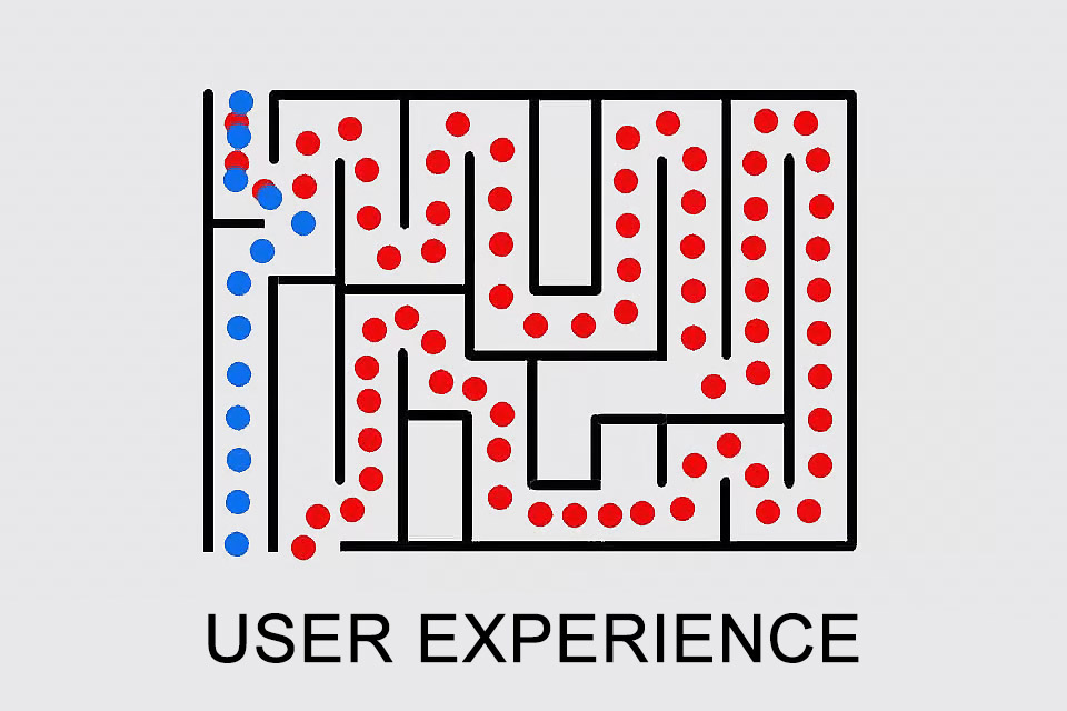
The demand is easy to formulate, but the implementation is rather difficult, because people are individual; what appeals to one user may not appeal to another. If one wants to get through a maze quickly, the blue route will be perceived positively and the red route negatively. But what happens if one likes to spend time in a maze, does the red route create a positive User Experience?
In addition, good usability – whatever that may be in a product, system or service – is rarely explicitly perceived, whereas bad usability is.
User Experience examples
It is easy to find examples of user experience. Imagine, for example, that there was an update of a software that you use regularly. How do you feel when
- existing functions that you have used regularly, are no longer available or are now located elsewhere in the menu?
- the announced new feature was implemented poorly or not at all?
- the previously working interface to another program no longer works after a release upgrade?
Imagine you are using a mobile phone, i.e. a system consisting of hardware and software. How do you feel when
- you can no longer use existing charging cables because the new device is delivered with a modified interface?
- you want to delete pre-installed apps, but the operating system prevents this?
- you can’t change the battery when the charging power decreases because it is permanently installed?
Imagine you want to fly from Berlin to New York. How do you feel when
- you have to carry your luggage about 500 metres, because the railway station is so far away from the airport buildings (Schoenefeld Airport) and there are no transport aids (luggage trolleys, conveyors)? Or if you arrive at the airport (Tegel) with 100 other people in a crowded bus, because otherwise there is no public transport?
- you have to be at the airport three hours before departure due to the announced security checks, but the check-in counter only opens two hours before departure? And you are allowed to pay overpriced prices for drinks after the security check because you were not allowed to bring your own drinks?
- you have booked pre-boarding, but are only allowed to board a bus first to be transported to the aircraft at the same time as all other passengers?
The three examples show that despite all the intended benefits, changes are not always perceived as beneficial and unfulfilled expectations lead directly to a bad experience. Furthermore, user experience encompasses more than just direct perception and reaction to a product or service, but also the entire scenario of use (e.g. not only the flight, but also the journey to the airport and the experiences there).
Factors influencing UX
There are a number of factors that influence the user experience. The basis for the factors lies in the human senses, that is
- sense of sight (eyes),
- sense of smell (nose),
- hearing (ears),
- sense of touch (skin),
- sense of taste (tongue).
And the sense of movement and balance also influence the user experience.
You can easily understand the influence your senses have on your User Experience by looking at your own personal experience. Take the typography of this website as an example. How do you feel about
- the font, the font size and the font weight,
- the font colour and the contrast between text and background,
- the line spacing, etc.?
With all these points – and many more – your UX can be influenced. In fact, on this site we try to provide understandable information that is easy and good to read on different devices. For example, we do not try to
- emphasise our energy as a service provider by using a particularly powerful font,
- to prove our individuality by using a fancy font, or
- use psychological tricks to encourage you to take action.
The provision of relevant information is therefore in the foreground. If this succeeds, you will have a good user experience. If this were done even better by using a different font or font size, you would have an even better User Experience.
Questions from the field
Here you will find some questions and answers from the field:
What are related terms in the context of user experience?
There are a number of terms and abbreviations that are frequently used in the context of user experience:
- Usability: This refers to ease of use and user-friendliness and can be addressed by requirements, for example, for the working environment and the hardware or software used. The quality of the implementation of these requirements is the basis for the users’ perceptions and reactions and thus for the user experience.
- Usability Engineer: A person who is primarily concerned with the interaction of people with products, systems or software.
- User Interface (UI): The interface through which people interact with products, systems or software. It is often abbreviated as UI. Accordingly, there can also be a User Interface Designer (UID); in practice, the Usability Engineer and the UID are often one and the same person.
- User Experience Researcher (UX Researcher): A person who defines who the users are, what their goals and motives are when using the product, system or software, what knowledge is required for this and what expectations are associated with it. In many companies, such tasks are taken on by a Requirements Engineer, a Requirements Analyst, a System Architect or an Information Architect, for example. The boundaries and transitions between the individual terms are fluid.
- UX writer: A person who creates content for digital products such as websites, mobile apps and software with the aim of improving the user experience. They are responsible for creating clear, concise and effective copy that guides users through the interface, helps them understand how to use the product and encourages them to perform specific actions.
Which design principles influence the UX?
- The Aesthetic Usability Effect describes how people perceive more aesthetic designs as much more intuitive than less aesthetic designs and consequently, when using a product, they believe that it actually works better.
- Miller’s Law explains that an average person can only grasp or remember 7 (plus/minus 2) elements. It is therefore advisable to group elements, but to place a maximum of 5 – 9 elements in the groups.
- Occams Razor addresses the thriftiness of elements, according to which as many elements as possible should be removed without restricting the overall functionality.
- Fitts’ Law states that the time required for a start-finish movement can be modelled as a function of distance and target size. Simply put, a button on a website should be large enough so that a user can both recognise what it is and easily press the button.
- The Serial Postion Effect describes users with their tendencies to remember the first and last element of a series best.
- Hick’s Law recommends simplifying decisions for users by, for example, breaking down complicated tasks into smaller ones or highlighting recommended options.
- Tesler’s Law states that every application has an inherent amount of complexity. The only question is who has to deal with it: the user or the application developer.
- Jakob’s Law describes that people transfer experiences, i.e. they expect visually similar products to be similar in content and function. In other words, it describes the power of habit.
- The Pareto Principle explains that a small number of high values contributes more to the total value of a defined set of values than a high number of small values. In terms of UX, this means concentrating on those areas that bring the greatest benefit to most users.
- The Restorff Effect – also known as the Isolation Effect – predicts that if there are several similar objects, people will remember the one that is most different from the others.
- The Zeigarnik Effect predicts that people remember interrupted, unfinished tasks better than completed, finished tasks. The use of progress bars to indicate incompletely completed tasks is therefore recommended.
- The Law of Proximity says that elements that are spatially closer to each other are perceived as belonging together. Visual aids such as common borders or monochrome backgrounds promote this effect.
- The Law of Similarity expresses that people perceive elements that belong together through similarities (shapes, colours, texture, size etc.).
- The Law of Unity – also known as the law of closed form – explains that people perceive simple, familiar forms more quickly than complicated and unknown ones. Interestingly, in the case of known forms, the human brain automatically adds imaginary lines and connections to missing lines and connections.
- The Law of Conciseness states that elements can be created by means of concise design – in colour, shape, size etc. An appropriately highlighted element cuts a fine figure or design, so to speak.
- The Law of Continuity describes that elements which are arranged in a straight line – the line of alignment – are perceived as belonging together.
- The Law of Common Destiny explains that even different elements pointing in the same direction are perceived as belonging together.
The list of design principles can certainly be easily extended. There are sources that additionally list, for example, the Parkinson’s Law, the Peak End Rule, the Law of Connectedness, the Law of Common Regions or the Postel’s Law. It is striking that the individual principles complement each other. And it is important that organisations deal with the principles, because often the reason for a lack of user experience could be a disregarded principle.
Which methods help to improve the user experience?
And how can companies improve user experience? In addition to design principles, there are a number of techniques and methods that are used in the course of product development and address UX at least indirectly:
- The Unified Modeling Language (UML) and the System Modeling Language (SysML) know the actor who is at the center of different considerations and serves as a trigger for different actions. In use cases, for example, this actor interacts with a system in which he wants and does something, and the system reacts accordingly.
- User stories focus on the expected functionality: “As a ‘user’ I want ‘functionality’ to achieve ‘benefit'”. They also define acceptance criteria.
- The Kano Model tries to determine basic, performance and enthusiasm factors for the use of a product or service. Basic and performance factors are relatively easy to ask for or observe, but enthusiasm factors are not.
- Observation techniques such as field observation, contextual inquiry and apprenticing, or survey techniques with questionnaires, interviews and self-writing help to determine expectations and concrete requirements as well as perceptions and reactions.
- The development of pretotypes and prototypes helps to check interactions and expectations.
- With simple click dummies or wireframes the expectations of users of a software or a website can be easily and early identified.
- A team’s involvement with a Design Challenge in the course of Design Thinking can address the user experience.
- …
How can a good UX be created step by step?
A positive user experience is very important and does not necessarily require a huge amount of effort. Here are some steps you can take to get started:
1. gather knowledge: Learn what needs and problems end users have. Which basic need should your product fulfil? Although nothing can replace the real user perspective, internal resources can also be used as sources of knowledge. There are various positions within the company that are in close contact with users and can therefore obtain an authentic picture. Record the results in an easily communicable form to make them accessible in different places. Proven artefacts are, for example, persona, value proposition and problem statement.
2. develop a UX vision: think about the experience journey you want to offer your users. For existing applications, it can be helpful to record the current status and identify possible optimisation options. For new developments, the path should not be too complex. A simple tool for visualisation that can also capture several target groups is “user journey mapping”.
3. bridge the gap between conception and implementation: added value is only created when it reaches the user. There is often a seemingly insurmountable gap between conception and realisation. In this case, it is helpful to develop and implement a “minimum viable design” in order to gather initial user experience as early as possible.
4. get feedback and make the UX measurable: To make sure you are on the right track, you need feedback. You can survey users, evaluate support requests or track user behaviour (e.g. number of logins).
5. keep at it and always return to the first step. Design is an iterative process!
These steps are a good starting point for improving the user experience. It is important to work on it continuously and to go through the process again and again in order to fulfil the users’ needs in the best possible way.
Further insights can be found in the blog post Clear the way for a positive user experience.
Why should organisations prioritise user experience?
Whether organisations like it or not, user experience itself – i.e. a concrete experience during use, including all impressions, reactions and moods of the users – cannot simply be added or omitted. What organisations can do, however, is to ensure that this experience is as good as possible.
Prioritising UX offers companies several advantages:
1. a positive user experience leads to satisfied users who enjoy using the software, recommend it to others and therefore help to attract customers.
2. a superior UX can be a decisive differentiating factor compared to competing products and ensure the long-term success of a software.
3. good UX minimises the demand for extensive customer support and training, which saves resources and increases efficiency.
4) UX research and testing collects valuable data that helps with product development and decision-making.
5. focussing on UX not only helps to solve problems, but also gives the team a sense of purpose and motivates them to work on the development of the software.
We are happy to recommend the blog post 5 reasons why you should prioritise user experience.
What is UX writing?
UX writing or UX copywriting means creating user-centred content. The aim is to address the user through the written text and make them feel welcome and valued. A UX writer is not a conventional copywriter, but rather a communicator or interpreter between the system and the user.
You can find more information on this topic in the blog post The right tone in UX writing.
Can there be successful UX Design without User Research?
Notes:
Here you will find an overview of DIN EN ISO 9241.
Here you will find some information from other sources (in German):
- Ohne den Sound springen die Käufer ab.
- Nicht nur das Auge isst mit.
- Der richtige Sound beim Einkaufen.
- Wie Haptik die Wirkung von Werbepost erhöht
The two books Design of Everyday Things by Don Norman and Don’t make me think by Steve Krug are well worth reading for UX designers.
If you like the article or would like to discuss it, please feel free to share it in your network. And if you have any comments, please do not hesitate to send us a message.
And here you will find additional information from our Smartpedia section:


