What is the Pareto Chart?
Smartpedia: A Pareto Chart is a bar chart that arranges categorised factors according to their significance and frequency and presents them in descending order relative to each other.
Pareto Chart – the display of problem causes sorted by their importance
A Pareto Chart is a bar chart that orders factors according to their importance and frequency. It goes back to the Italian engineer, economist and sociologist Vilfredo Pareto, who recognized that a small number of high values of a defined set of values contributes more to its total value than a large number of small values. This is often referred to as an 80-20 rule or the Pareto principle.
The visualisation in the Pareto Chart
The Pareto Chart visualizes the distribution of the factors by
- displays factors sorted by category on the horizontal axis – i.e. data such as problem causes or error sources,
- a commonly used measure, such as frequency, which defines the cost-weighted frequency or probability of an event as a measure of the vertical axis,
- arranges the data as columns in descending order from the left to the right, so that the column with the highest value is on the left and thus e.g. names the biggest problem first,
- represents the column height relative to each other.
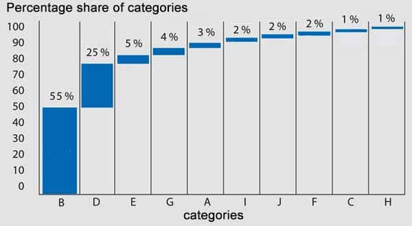
Here you can see a simple Pareto Chart with an axis of the added percentage category shares and an axis with the corresponding categories sorted by their percentage share.
The purpose of the Pareto Chart
In principle, data should be visualized in a Pareto diagram in a relatively simple and clear manner. The purpose is to quickly recognize the meaning of a problem or the effects of an error. If this is successful, it is a good tool for error and problem analysis. According to Vilfredo Pareto, an organization should then address the biggest problems and eliminate about 80% of all cases as quickly as possible (in this example, categories B and D).
Notes:
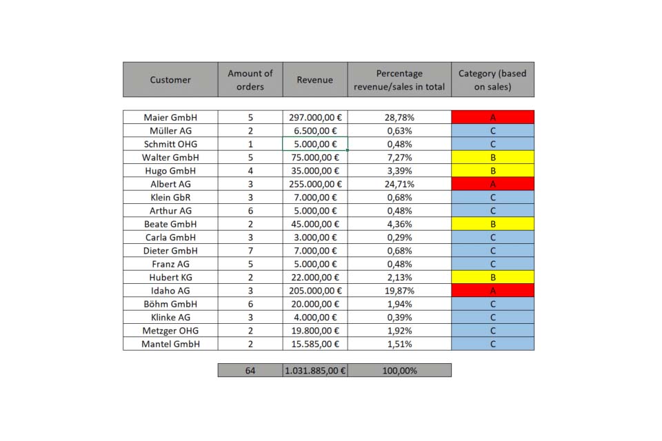
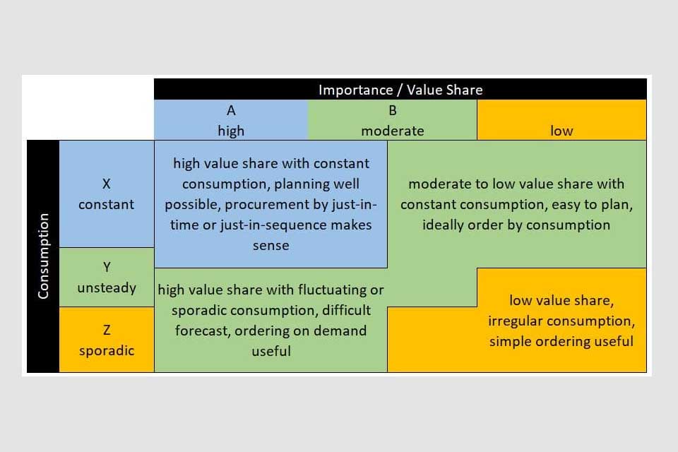
In addition to the pure visualization of problems and errors, the Pareto diagram is also suitable for the visualisation of the results of an ABC analysis or an XYZ analysis.
If you like the article or would like to discuss it, please feel free to share it in your network. And if you have any comments, please do not hesitate to send us a message.
Here you will find additional information from our Smartpedia section:


