What is a Burn Down Chart?
Smartpedia: A burn down chart visualises the remaining effort in relation to the remaining time in a scrum sprint or a defined time interval.
Burn Down Chart Definition
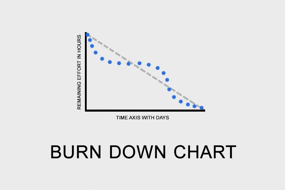
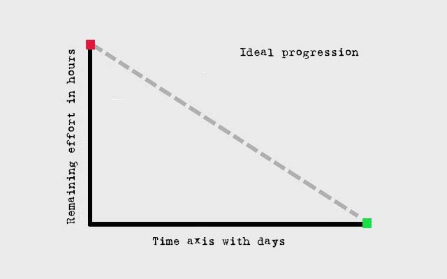
A burn down chart is a graphical representation of remaining effort in relation to the remaining time in a defined time interval. Put simply: it shows the remaining effort for activities still to be completed over time. The burn down chart is a line chart used to predict whether the scheduled work will be completed by the scheduled time.
Often the burn down chat is used in agile development projects, especially in a Scrum approach; accordingly it is also called Sprint Burndown. In principle, however, it can be used in all projects – e.g. also for iterations or releases – where the progress or stage of completion can be measured. The term “burn down” signals how much work has already been done.
Advantages of the Burn Down Chart
As an instrument of project and development control, the burn down chart offers several advantages:
- With a little practice it is easy to understand (see examples below).
- It provides a quick overview of the work still to be done in the sprint, iteration or project.
- It visualises the status quo of the work done in relation to the planned work on a key date. In other words: it shows the status of the work on the current day.
Prerequisite for the Usage of Burn Down Charts
In order to take advantage of these benefits, there are also some prerequisites for using the diagram:
- There must be a common understanding of the structure of the diagram. The display of the remaining effort in hours on the Y-axis of the burn down chart is relatively common. Story points or tasks are also possible. In most cases, the days up to the end of the defined time interval are displayed on the X-axis. At least theoretically, alternative data such as milestones could be used.
- It must be maintained continuously, because this is the only way to make relatively valid assumptions. To this end, each team member estimates the remaining effort of his tasks on a daily basis, which are then shown cumulatively in the diagram.
- The remaining effort must be estimable for the team members, i.e. the tasks to be completed must be planned in a meaningful granularity. New findings can also lead to a situation where the remaining effort is estimated to be higher than the day before.
How can the Burn Down Chart be interpreted?
Let’s take a look at some examples:
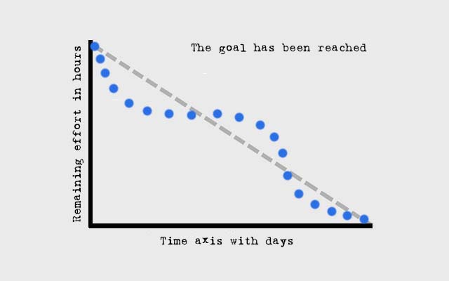
In the example “The goal has been reached” you see a relatively normal course: first the team was slightly faster than planned (the blue dotted line is below the dashed line showing the average or proportional course), then it was a little slower (the blue dots are above the dashed line). Shortly before the end of the interval the team was again ahead of the plan (the blue dots are below the dashed line again) and at the end the goal was reached (remaining effort equal to zero).
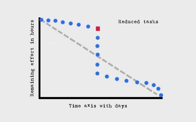
In the example “The Reduced Tasks” you can see a vertical line (starting at the red mark) in the middle of the diagram. This means that in the course of the interval on this day the tasks were reduced. Otherwise the development team would probably have missed the target – e.g. a sprint goal – significantly. The exact cause for the reduction of tasks cannot be seen from the burn down diagram (see criticism or limits of the representation).
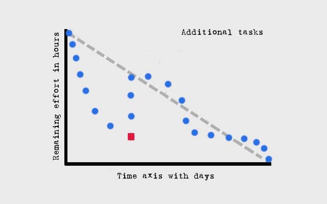
In the example “The additional tasks” you see the exact opposite of the example before: the team was so well on schedule that it was able to take over additional tasks, so that there was a vertical increase of the remaining effort on one day (red marking). In such a case it is not a sprint according to the rules of Scrum, because the circumference remains untouched during the sprint.
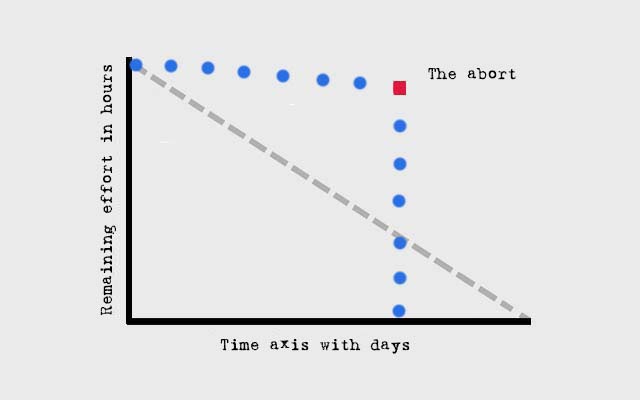
In the example “The abort” only a marginal progress can be seen in the course of time, so that the team pulled the tear rope and ended the time interval prematurely.
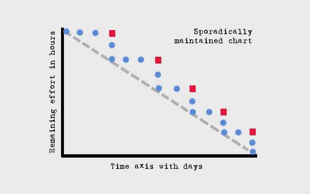
And in the last example you can see a staircase (always indicated by the red markings). This is a clear indication that the diagram was only maintained sporadically, because at the time of updating the remaining effort always fell to the level of the ideal line.
Criticism and Limits of burn down charts
With all the simplicity of the representation, there are also some points of criticism or limits of the burn down chart:
- The representation itself assumes that the same number of employees with the same capacity are involved in the processing of the tasks in the period under consideration. This is not possible in many organisations because employees often work on several projects at the same time, carry out line activities in addition to project work, occasionally go on vacation or even fall ill at short notice. Even in Scrum there are always impediments which at least limit the continuous work on defined tasks.
- The comparison between the idealised target and the actual situation (which also depends on the ability of individual employees to estimate their remaining efforts well) is at best an indicator of whether a defined goal can be achieved within a defined time window; but that’s all it is.
- The reasons for problems, delays or faster work cannot be read from the representation. For example, a deviation could be due to the good or bad productivity of the team, but it could also be due to imprecise planning or tasks added at short notice. Some publications also talk about overloading and understraining the team – but such information cannot be read from the diagram.
- If the remaining effort is fundamentally underestimated, the burn down chart will always look positive until shortly before the end of the observation period and will therefore not reflect reality. Accordingly, a continuous overestimation will occur.
The Scrum Guide characterises the burn-down chart and alternatives as follows: “While proven useful, these do not replace the importance of empiricism. In complex environments, what will happen is unknown. Only what has already happened may be used for forward-looking decision making.” In other words, it is ONE indicator of whether the planned work will be completed by the planned date. No more, no less.
In some organisations, several teams work in parallel on a development. A common diagram for all teams would be conceivable here, but since delays of individual teams would not be easily recognisable, it is probably a better idea to use one chart per team. Ideally, this should be discussed during the Daily Scrum.
Is there a central reason why some organisations prefer burndown charts and others burn up charts?
Notes:
Here you will find a video on burn-down charts.
Here you will find a German podcast about using burn-down-charts in sprints.
If you like the article or would like to discuss it, please feel free to share it in your network. And if you have any comments, please do not hesitate to send us a message.
And here you can find additional information from our t2informatik Blog:
