What is Wireframing?
Table of Contents: Definition – Design – Abstraction and Concept – Types – Advantages – Software – Questions from the field – Notes
Smartpedia: Wireframing is a process for designing websites, web applications and software screens that includes information design, navigation design and interface design.
Wireframing Definition
Anyone who designs a website or the Graphical User Interface (GUI) of a software is faced with the question of what is displayed how and where. What information is conveyed, what is the structure of the presentation and how should the user navigate? A wireframe describes the structural model of
- a website,
- a software or
- a web application.
It is a schematic design that defines which elements are used in which places and how the navigation between the elements on individual or different web pages or screens of a software or web application works. The process of creating a wireframe is called wireframing.
The Design of Information, Navigation and Interface
Wireframing involves designing a framework that visualises the information architecture, navigation and user interface. It is therefore about
- Information Design,
- Navigation Design and
- Interface design.
Alternative terms for Wireframe are Page Schematics or Screen Blueprint.
Abstraction and Conception in Wireframing
The focus of wireframing is on the structure of the display and on user guidance. It is about
- an abstraction of concrete content such as texts or images.
- the conceptual design of one or more user interfaces and thus the general arrangement of elements such as logo, headers, headings, text fields, search fields, forms etc.
- navigation, i.e. the use of menus, e.g. in the header, footer and by breadcrumb, or the calling of commands, e.g. by right mouse button or short codes and keyboard input.
There are different opinions regarding the consideration of corporate identity. Most publications prescribe the use of colours, formats and fonts more for mockups and less for wireframes. Either way, in practice this point is important. A subsequent adaptation of an implementation always causes more effort than the correct use of agreed aspects from the beginning.
Wireframes Types
There are two types of wireframes:
- Low-fidelity wireframes
- High-fidelity wireframes
Low-fidelity wireframes are understood to be the simplest designs, e.g. drawings created with pen and paper. Even a simple design created by software can be a low-fidelity wireframe. The focus is on the essentials, e.g. the selection and arrangement of elements. Advantages are the fast, cost-effective and in the best sense simple abstraction. Sometimes the use of dummy text as placeholder for content and labels is mentioned as a feature, but such placeholders are also used in high-fidelity wireframes.
In comparison, the high-fidelity wireframe is a more mature, visually and also technically more detailed variant. For example, elements have information such as concrete dimensions, and the behavior and possible actions of interactive elements can be observed. Of course, the creation is more time-consuming and expensive, but the understanding of the parties involved is higher. And high-fidelity wireframes actually enable a first (positive) user experience.
In summary, the elaboration of the details and the completeness of the illustration are the main distinguishing features. However, more important than a clear distinction between the two types is the following: The two types are not in competition with each other, but build on each other. With a low-fidelity wireframe, rough structures can be quickly defined and an initial understanding between the parties involved can be generated. With a high-fidelity wireframe this understanding is expanded, details are integrated and interactions are made possible. Alternatively, the two types are also referred to as static and dynamic wireframes.
Advantages of Wireframes
Wireframes offers a number of advantages:
- The creator of the wireframe gains clarity about the structure of his website or application.
- A wireframe can be realised quickly – at least with regard to the creation. The more extensive or complex a solution is, the longer the creation will take.
- Since a wireframe is “drawn”, the procedure is much cheaper than rashly starting to implement a solution or program a website.
- Wireframing is also favourable with regard to the use of materials. In the simplest expansion stage, pen and paper are sufficient. Of course, the more people are involved in the process, the more effort it takes or the costs increase depending on the possible technical solutions (see Wireframing Tools).
- Customers, users, colleagues, clients etc. can be involved at an early stage. And the exchange between the respective parties is encouraged.
- An iterative approach is supported, in which new insights can be easily used and integrated; much easier than with later adjustments of the implementation.
Wireframe Software
In some practical reports it can be read that the creation of high-fidelity wireframes using software and interface libraries works as fast as with low-fidelity wireframes. Such statements should of course be treated with caution; they may have been made by a wireframe software vendor.
Here you can find a list of wireframe software:
- Mockplus
- Sketch
- Creatie
- Omnigraffle
- Axure
- Figma
- Lucidchart
- UXPin
- Proto.io
- Balsamiq
- Marvel
- Justinmind
- Microsoft Visio
- Miro
- Moqups
- AFFINITY
- Adobe Illustrator
- MockFlow
The list is of course not exhaustive and can certainly be supplemented.
Questions from the field
Here you will find some questions and answers from the field:
What is a mid-fidelity wireframe?
A mid-fidelity wireframe offers a balance between simplicity and level of detail. It is more detailed than a low-fidelity wireframe, but does not yet achieve the visual precision of a high-fidelity wireframe. It usually has a clearer structure and more precise placement of elements, but does not yet include sophisticated visual designs such as colours, images or specific fonts.
Mid-fidelity wireframes are a good basis for meetings with stakeholders to discuss the general functionality and structure without focussing on the final design. They are detailed enough to demonstrate the flow and interaction, but flexible enough to be easily customised. Especially when the focus is on better defining the layout and structure of the content as well as the main functions and interactions without being distracted by visual details, they are considered useful.
PS: In many design processes, the wireframe naturally evolves from low-fidelity to mid-fidelity without this being explicitly planned. As the team works on the project, elements become more detailed and specific, and so a mid-fidelity wireframe emerges organically and evolutionarily as an intermediate stage. In a structured design process, however, it can also be planned as a deliberate step. This often happens in projects where it is important to create a clear separation between the concept development and visual design phases.
What does a typical wireframing process look like?
The wireframing process begins with the collection and analysis of requirements, with the aim of visualising the basic structure of a website or application. Once the target audience, business objectives and key features have been defined, a first draft, also known as a low-fidelity wireframe, is created. This early draft is deliberately kept simple and only shows the rough arrangement of content and functions, without considering visual details or specific design elements. This design is often first sketched on paper, a whiteboard or with simple digital tools to quickly capture and test ideas.
As soon as the rough concept is ready, the wireframe is worked out digitally in a specialised tool. Many tools offer templates, user interface components and functions for collaborative editing, which makes the process more efficient and promotes team collaboration. The digital design makes it possible to visualise the structure more precisely and define interactions more clearly. In this phase, the design is iteratively refined based on feedback from stakeholders and further considerations regarding user guidance and functionality.
As the process continues, the interactions and user guidance are worked out in more detail; for example, prototypes can be created and user flows simulated using appropriate tools, allowing potential problems to be recognised and resolved at an early stage.
During the entire wireframing process, the focus remains on functionality and user-friendliness. Only in the later phases of the process, when the basic layout has been finalised and the interactions have been worked out, does the integration of visual design aspects begin. The result of this process is a high-fidelity wireframe that contains not only the exact placement of elements, but also design details such as colours, typography and graphics. This final result forms the basis for the design and development team to realise the application or website within a clearly defined framework.
What are best practices and typical mistakes in wireframing?
There are some recommendations when working with wireframes and there are some typical mistakes that should of course be avoided. Here are some best practices:
- Before starting the wireframing process, define the target audience, business goals and key features. A clear understanding of these factors will ensure that the process is aligned with the needs of the users and the goals of the project.
- Start with a simple design that only shows the basic structure and functionality. Avoid superfluous details in this phase and concentrate on the placement of content and navigation.
- Develop the design step by step, based on continuous feedback from actual users. Use regular reviews to ensure that the design meets requirements and responds flexibly to changes.
- Always keep the user experience in focus. Test interim results with real users early on to ensure the user experience is intuitive and effective.
- Integrate designers, developers and other stakeholders into the process from the start. Use collaborative tools to encourage the exchange of ideas and develop a unified vision.
- And make sure that all important decisions and assumptions are documented during the process. This facilitates later adjustments and handover to the development team.
And here are some typical mistakes:
- A common mistake is to add too many details in the early stages of wireframing. This can slow down the process and create unnecessary complexity. It is important to proceed step by step and only increase the level of detail in later phases.
- If the design is developed without regular feedback from users, there is a risk that important needs will be overlooked. This mistake can lead to a product that does not meet expectations. In addition, subsequent corrections are usually time-consuming and expensive.
- A design should allow for clear and precise communication; if it is too complex or unstructured, this can cause misunderstandings and hinder the design process.
- Another common mistake is to focus too early on visual aspects rather than functionality and usability. This can take the focus away from the actual purpose of what is being done and lead to sub-optimal design decisions.
- If technical parameters and development restrictions are not taken into account, costly adjustments may be necessary later on. It is important to work with the development team early on to ensure that the wireframe is feasible.
- Sometimes a design is considered final without sufficient iteration and testing. This mistake can lead to design problems not being recognised until later stages, which can delay and increase the cost of the development process.
Unsurprisingly, following best practices and avoiding typical mistakes helps to make the process efficient and effective, resulting in a better end product.
What do you think of the following statement: ‘A user interface is like a joke. If you have to explain it, it’s not very good.’
Notes:
If you like the article or would like to discuss it, please feel free to share it in your network. And if you have any comments, please do not hesitate to send us a message.
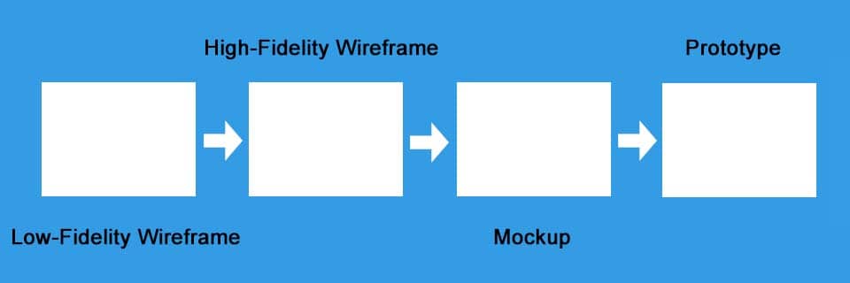
The question of how to differentiate between wireframes, mockups and prototypes – e.g. click dummies – comes up from time to time. Even if the boundaries are rather fluid, the following illustration may help:
Here you will find additional information from our Smartpedia section:


